| Author | Message | ||
| hieronymous
Intermediate Member Username: hieronymous Post Number: 186 Registered: 1-2005 |
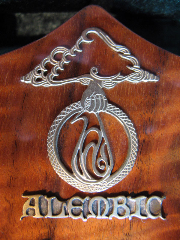
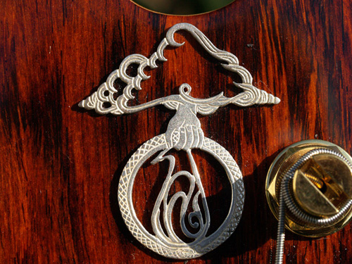
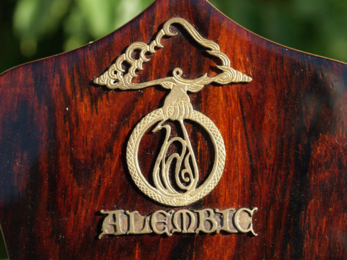
I thought this might be fun - show us pictures of the logos on your Alembics! The Alembic logo, although perhaps not as well-known by the general public as the "Steal Your Face" logo (both designed by Bob Thomas) represents the height of musical instrument design and technology for those in the know. My first Alembic was a 1985 Spoiler/Exploiter. At the time I was only dimly aware of the rich history and diversity of styles of Alembic, so I thought the logo was "normal": 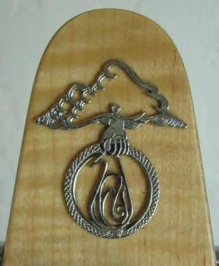 It doesn't have the "rays" coming down from the clouds, but you can see the details in the hand, dragon, etc. My next Alembic was the infamous "wishbone" doubleneck (infamous mainly for its weight?!!), with its interesting logo placement down near the tailpieces & strap pin. It was a while before I noticed how different it is from the one on my Exploiter: 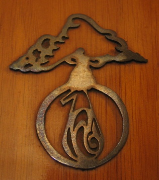 If I had to state a preference, it would be for the older one, but that may just be a reflection of the rich history that the bass itself resonates. I also love how simple it is, while still expressing the idea behind it. So - those are mine - let's see some of yours!!! I know there are some amazing ones out there. But it doesn't matter if they are made of precious metals, precious stones, or plastic - they're all Alembic! | ||
| mica
Moderator Username: mica Post Number: 4808 Registered: 6-2000 |
On your older one, the logo is handcut from a sheet of sterling silver. The newer logos are cast in various metals by a local jeweller. There's some other strange early logos, here's a few I found with a quick scan of my files: 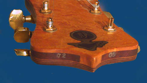 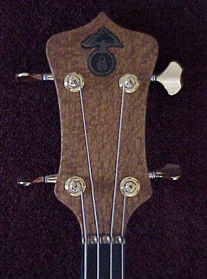 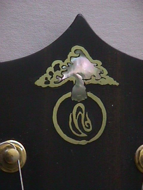 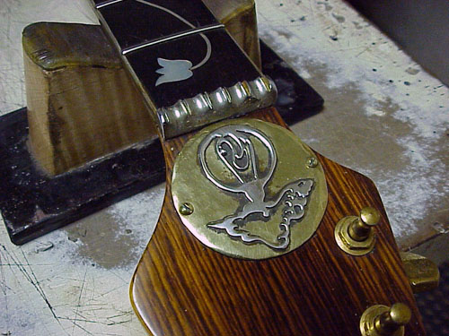 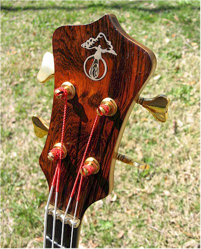 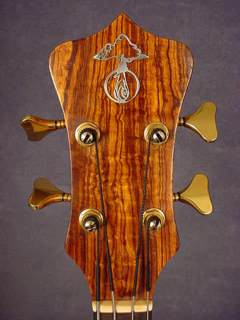 These are roughly in chronilogical order. | ||
| davehouck
Moderator Username: davehouck Post Number: 5509 Registered: 5-2002 |
Cool pics Mica!! Lotsa interesting stuff; like the laminate pattern on 72-05! | ||
| bsee
Senior Member Username: bsee Post Number: 1784 Registered: 3-2004 |
Mica, that third one looks like a ghost floating inside a circle. Really cool history lesson. Unfortunately, one logo that would have to be included in any study would be the one on Dark Star. | ||
| hieronymous
Intermediate Member Username: hieronymous Post Number: 188 Registered: 1-2005 |
Wow, thanks for the pics Mica, and thanks for letting me know that the logo on my doubleneck is silver! I thought the fourth picture was Phil Lesh's Orange Osage, then realized it was a guitar! There are some interesting pictures of Phil's bass in this thread. Keep 'em coming folks! | ||
| 82daion
Member Username: 82daion Post Number: 91 Registered: 5-2005 |
From my 1975 Series I: 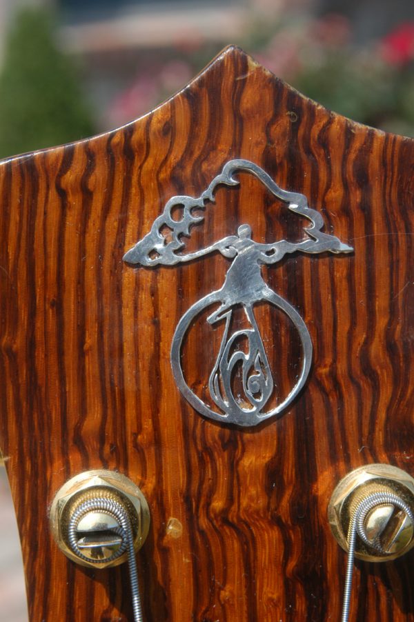 | ||
| bluplirst
Junior Username: bluplirst Post Number: 28 Registered: 12-2004 |
Plum Pudding's brass logo 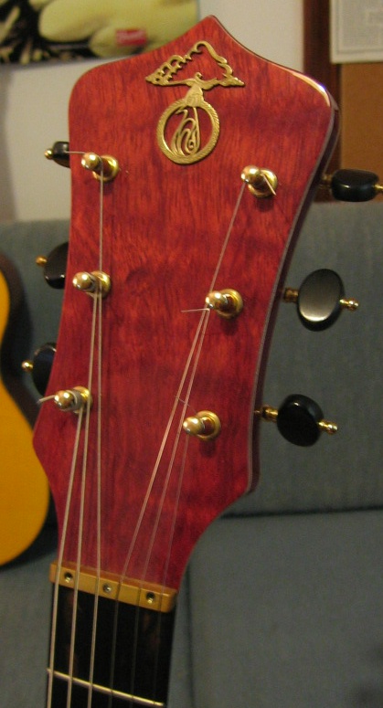 | ||
| cozmik_cowboy
Intermediate Member Username: cozmik_cowboy Post Number: 197 Registered: 10-2006 |
Wow - any chance you could show us the rest of number 4, Mica? Just that much has me lusting severely! Peter | ||
| keavin
Senior Member Username: keavin Post Number: 1279 Registered: 12-2002 |
 | ||
| byoung
Senior Member Username: byoung Post Number: 756 Registered: 12-2004 |
Inlaid logo on the forthcoming Series II:  | ||
| crgaston
Senior Member Username: crgaston Post Number: 429 Registered: 11-2005 |
Bradley, that beveled Omega Crown with inlaid logo is the shizzle! Here's one with a black m.o.p. cloud... 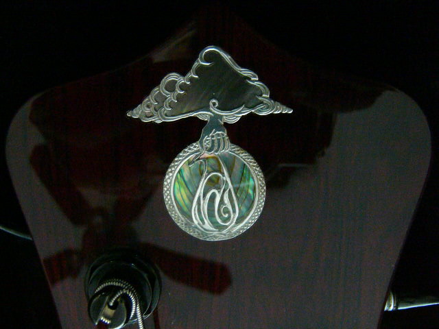 ...and a ceiling fan reflection! | ||
| jacko
Senior Member Username: jacko Post Number: 1333 Registered: 10-2002 |
This is my favourite.... 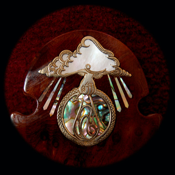 | ||
| paulman
Advanced Member Username: paulman Post Number: 246 Registered: 2-2005 |
I'd like to second the request for more pics of #4, I'm interested to see the rest of that guitar (bass or otherwise) Thanks for posting those Mica  | ||
| the_mule
Senior Member Username: the_mule Post Number: 684 Registered: 1-2004 |
 | ||
| jseitang
Advanced Member Username: jseitang Post Number: 215 Registered: 6-2002 |
the black MOP cloud is real dark looking.... very very cool, it has a very realistic look when you stare into the cloud....the one with the rays is the most psychedelic looking one... all are amazing. | ||
| byoung
Senior Member Username: byoung Post Number: 759 Registered: 12-2004 |
Charles, Thanks for the compliment-- I'm pretty enamored of it, myself. | ||
| pierreyves
Intermediate Member Username: pierreyves Post Number: 163 Registered: 11-2006 |
  1/logo of my MK5 deluxe double omega 2/logo of my SC deluxe | ||
| jazzyvee
Senior Member Username: jazzyvee Post Number: 961 Registered: 6-2002 |
My Orion Guitar headstock in Maple 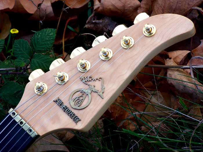 | ||
| mele_aloha
Advanced Member Username: mele_aloha Post Number: 243 Registered: 1-2007 |
Jacko, You beat me to the punch. That is the one that I have on my desktop and also ordered for my Series II. Good topic though! Paul | ||
| rraymond
Advanced Member Username: rraymond Post Number: 309 Registered: 6-2002 |
Here's a closeup of the logo on Pinot. 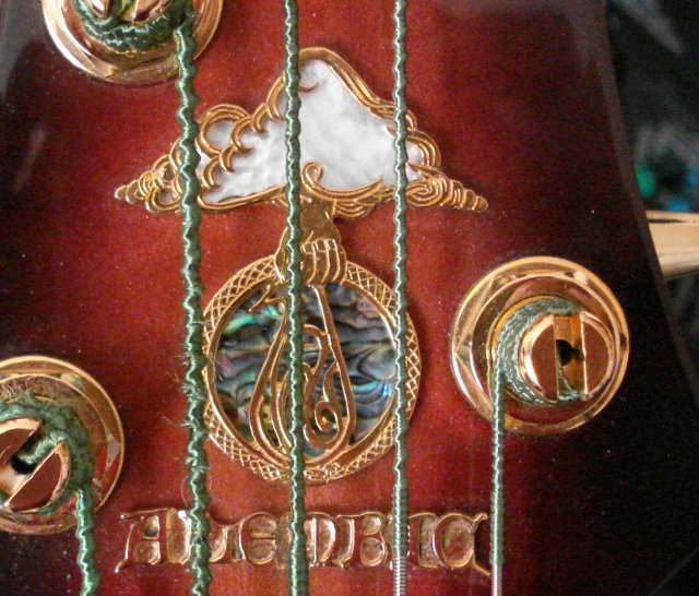 | ||
| mica
Moderator Username: mica Post Number: 4833 Registered: 6-2000 |
Found another oldie: 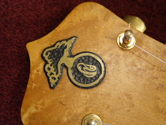 | ||
| crgaston
Senior Member Username: crgaston Post Number: 435 Registered: 11-2005 |
You know, I kind of feel stupid, but I never noticed that that was a stylized letter "A" inside the alembic vessel. I always thought it was just supposed to be some swirling reactants or something. The older logos without the vessel make it pretty evident, though. You really do learn something new every day... | ||
| elwoodblue
Intermediate Member Username: elwoodblue Post Number: 165 Registered: 6-2002 |
ahhhh...number 1...sigh...was a pretty cool pAddle. I'm continually amazed at the logo on the T-shirts...best silkscreening around! | ||
| hieronymous
Intermediate Member Username: hieronymous Post Number: 197 Registered: 1-2005 |
That last one Mica posted would be this one wouldn't it? | ||
| lidon2001
Advanced Member Username: lidon2001 Post Number: 337 Registered: 4-2005 |
Gold on Amboyna: 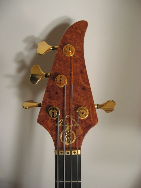 | ||
| jacko
Senior Member Username: jacko Post Number: 1366 Registered: 10-2002 |
harry.... "That last one Mica posted would be this one wouldn't it?". I'm not sure it is. The logo on the peanut guitar looks like on of the early transfers (or decal in your language). Also, the wood looks different. graeme | ||
| room037
Intermediate Member Username: room037 Post Number: 184 Registered: 9-2003 |
This is my 20th Anniversary bass's logo. 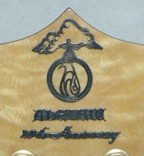 Standard logo on Fan head (76' 421) 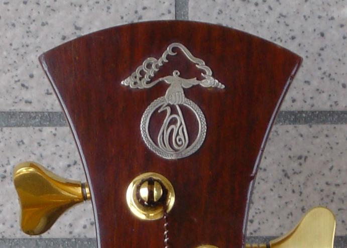 Standard logo on Cone head (82' 2059) 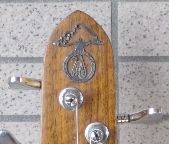 | ||
| jacko
Senior Member Username: jacko Post Number: 1375 Registered: 10-2002 |
Ok. having looked at the early spoiler logo, i'm changing my mind about the peanut logo. However, I still think it's different to the one mica posted. That looks like birdseye maple whereas the peanut looks like flame. Graeme | ||
| fc_spoiler
Senior Member Username: fc_spoiler Post Number: 628 Registered: 5-2006 |
Here's the Spoiler Decal: 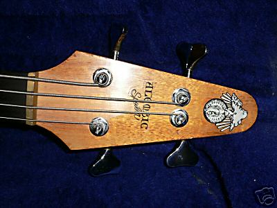 | ||
| hieronymous
Intermediate Member Username: hieronymous Post Number: 198 Registered: 1-2005 |
Thanks everybody, I think this has turned out to be a really neat thread! I've learned a lot - I didn't recognize the "A" in the logo either! I'm glad we got a picture of a decal one too. Oh, and Graeme, on looking carefully, I'm inclined to agree with you that they look like different guitars. I should have looked more closely the first time! | ||
| elwoodblue
Intermediate Member Username: elwoodblue Post Number: 171 Registered: 6-2002 |
...I hear you shouldn't stare into the Cloud too long... ...of course there might be something good in there.(or aliens behind it). |