| Author | Message | ||
| Mica Wickersham (mica)
Moderator Username: mica Post Number: 66 Registered: 6-2000 |
Here's the sketch and template for the custom body shape that blends the Spectrum and Tribute: 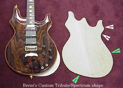 Be aware that the template always looks huge compared to the finished guitar, so I put a standard Tribute over the drawing of the new template to illustrate that your design isn't that much bigger. The lower horn needed adjusting slightly (between the white arrows)to keep a balanced look with the new slanted bottom (between the green arrows). From our discussion yesterday, I've asked Chip to select a few Coco Bolo tops that fit your general liking. I'll photograph these this afternoon and post them on this thread. | ||
| Brent Forman (brentf)
New Username: brentf Post Number: 1 Registered: 6-2002 |
Wild! Can you super impose the location of kneck and pickups? Even a just a line would be helpful. I think the lower horn needs to be a little larger and the slanted bottom maybe slightly less exaggerated. Maybe slight changes to both to balance even more. Everything else looks great! This is the locale of the kneck that I would imagine, is this correct or way off? Thanks, Brent 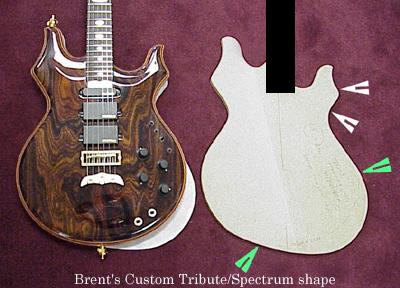 | ||
| Mica Wickersham (mica)
Moderator Username: mica Post Number: 67 Registered: 6-2000 |
Is this more what you had in mind? 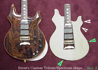 I'm a little worried about changing the horn shape too much. With the smaller lower bout, I think the previous enlargement keeps that balanced look. | ||
| Brent Forman (brentf)
New Username: brentf Post Number: 2 Registered: 6-2002 |
Yes, we are definitely getting close. What if we use this kneck position but put the exaggeration back into the bottom but we move the lower edge (where the right hand green arrow is)inward a hair to make the slanted bottom sharper and less round. Does that make sense? | ||
| Brent Forman (brentf)
New Username: brentf Post Number: 3 Registered: 6-2002 |
Hi Mica, See how this strikes ya. 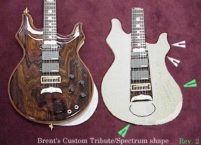 | ||
| Mica Wickersham (mica)
Moderator Username: mica Post Number: 70 Registered: 6-2000 |
Here's the bookmatches to select your top from: 624: Overall darker and less orangey: 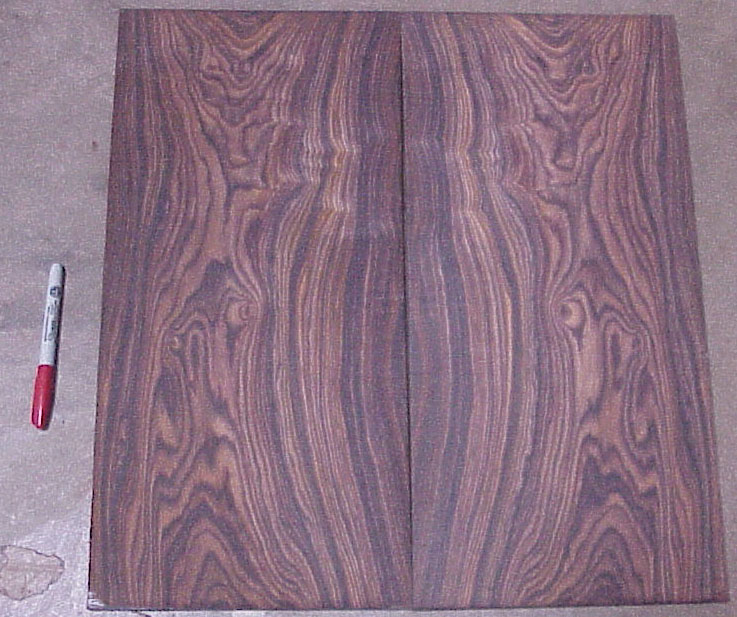 625: Red orange with two bull's eyes: 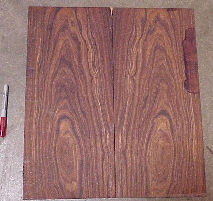 628: Darker with neat wavy grain near bottom: 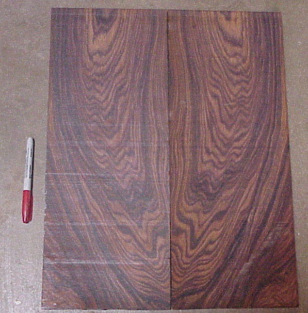 630: Nice mix of straight and swirly grain: 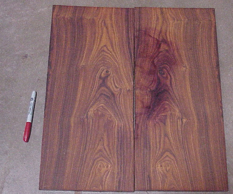 Please tell me your preference by the number of the bookmatch, thanks. I'll get the template modified by Kris to reflect the most recent changes (which look really nice!). I don't think he'll be able to do this until Friday or Monday. | ||
| Brent Forman (brentf)
New Username: brentf Post Number: 4 Registered: 6-2002 |
Definitely 624. It would be nice to have it a little lighter if possible but it is also fine as is. I assume it would come out like the example Tribute in the above picture? Btw, scratch my last body shape. Check this one out. I like it much better. I gave it a little more on the bottom but thinned it through the middle. I'll explain why offline. Oh and if looks weird remember to turn the image clockwise 90 degrees, makes much more sense then. 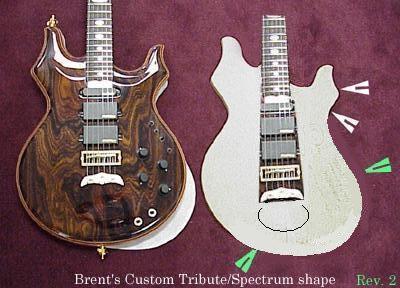 | ||
| Mica Wickersham (mica)
Moderator Username: mica Post Number: 71 Registered: 6-2000 |
Here's what I come up with the smooth out the curves: 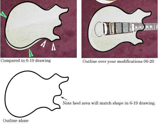 By shaving the right side of the guitar like you did, the pickup selector switches will be a little closer to the strings (about 3/4"). This will work fine as long as you don't think it will interfere with your playing. If you like the form, we can make the hard template on Monday and start choppin' wood while you're on vacation. | ||
| Brent Forman (brentf)
New Username: brentf Post Number: 5 Registered: 6-2002 |
I added a little more thickness to the backside of the lower horn (highlighted in yellow). I think it gives a more balanced look. 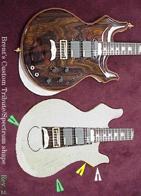 | ||
| Mica Wickersham (mica)
Moderator Username: mica Post Number: 74 Registered: 6-2000 |
Whew! Kris spliced on the template from earlier and applied your changes: 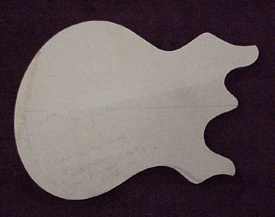 Here's the sketch from the original template overlaid on the latest template so you can see the changes: 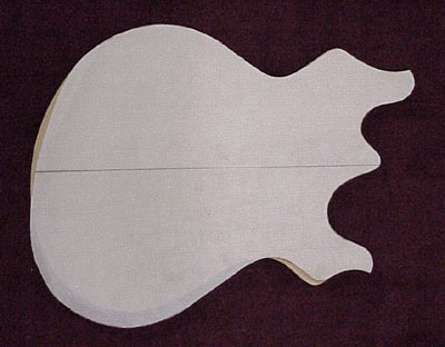 | ||
| Brent Forman (brentf)
New Username: brentf Post Number: 6 Registered: 6-2002 |
Top picture right? Perfect... Magnificent... | ||
| Mica Wickersham (mica)
Moderator Username: mica Post Number: 140 Registered: 6-2000 |
Bob's working on the program for routing your guitar, it's the next step. Here's how things look today: 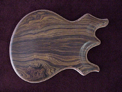 Front 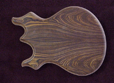 Back 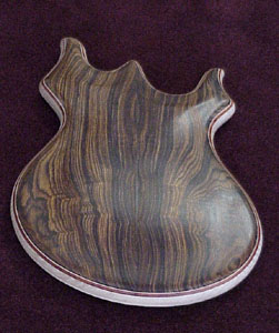 A view up the body to get an idea of the contours.  Side view of Flame Maple core, not yet sanded smooth and already showing off the figure. | ||
| Brent Forman (brentf)
New Username: brentf Post Number: 7 Registered: 6-2002 |
Wow, my birthday was yesterday and this update is a wonderful gift! It looks beautiful and exactly what I want. I am really getting excited for this creation. If you have the oppurtunity, it would be great to get another shot of the contours, I can't make them out very clearly, especially towards the rounded bottom of the guitar. thanks, Brent | ||
| Brent Forman (brentf)
New Username: brentf Post Number: 8 Registered: 6-2002 |
I was just playing around with the Tribute hardware ontop of my guitar, so I decided to post this. Do I have the position and scale of the hardware anywhere close to correct? I can't believe how breathtaking the wood on this guitar is and will be. Looking forward to your input.. thanks, Brent 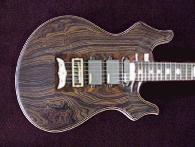 | ||
| Mica Wickersham (mica)
Moderator Username: mica Post Number: 161 Registered: 6-2000 |
Here's the template with the map: 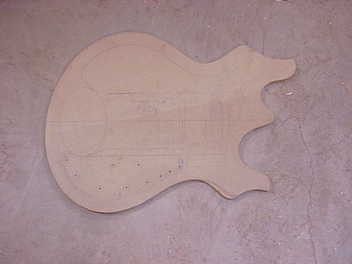 You can see where the pickups and bridge go from it. You can also get an idea of how big the extra electronics compartment will be. | ||
| Brent Forman (brentf)
New Username: brentf Post Number: 9 Registered: 6-2002 |
Great, thanks! Looks like I was pretty close. A couple quick questions for you though: What is the outlined area that I have a pointer on? Also, the oval looks a little large. I would hate to cover up so much of that beautiful wood. Maybe something a little less dominant would be better. What do you think? It does look very balanced though. 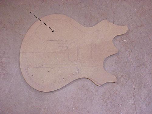 | ||
| Mica Wickersham (mica)
Moderator Username: mica Post Number: 400 Registered: 6-2000 |
Here's the guitar, just waiting for the inlays: 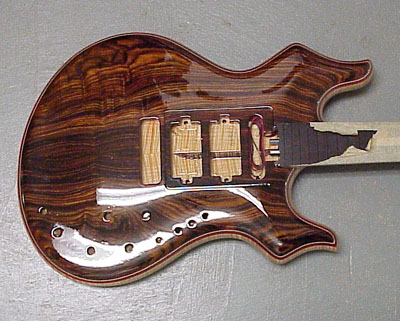 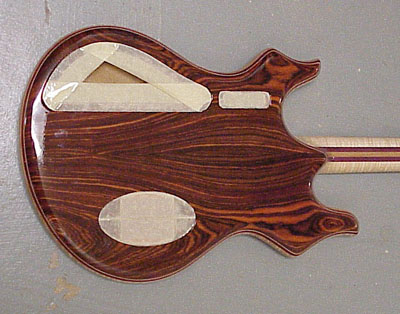 James will be ready to do your inlays perhaps as early as November 25th. | ||
| brentf
Junior Username: brentf Post Number: 11 Registered: 6-2002 |
Hello all, How are the inlays looking on my guitar? Just chompin' at the bit  . . thanks, Brent | ||
| mica
Moderator Username: mica Post Number: 1016 Registered: 6-2000 |
Jon is just about finished with them. I just went out and encouraged him to get them completed, since your guitar is so close to being done. The red/blue pearloid turned out just great, I'm sure it's exactly the look your after. | ||
| sdewalle
New Username: sdewalle Post Number: 3 Registered: 5-2003 |
Brent, Great looking guitar. Love the curves. I have no idea why, but that guitar makes me think of one of those cartoon cars that rears back and then takes off. I love it. You will too I'm sure. | ||
| palembic
Senior Member Username: palembic Post Number: 492 Registered: 9-2002 |
Yes, this design gives the Tribute model some "speed"! Very nicely styled!! Paul the bad one | ||
| brentf
Junior Username: brentf Post Number: 12 Registered: 6-2002 |
Yes, adding speed to the Tribute is a good way to put it. I thought about the design quite a bit but I knew it was up to Alembic to make it work. I think it came out better than my mind could possibly of procured. Wait until you see the whole body shape (it has a Spectrum head). Brent | ||
| brentf
Junior Username: brentf Post Number: 13 Registered: 6-2002 |
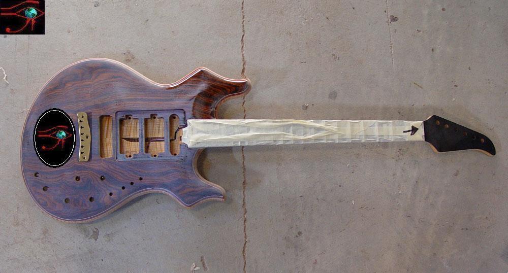 Hi all, What is the consensus? Is this as exciting a concept as I hope? Or am I just biased? I feel like I am swimming up stream on this one. Love to hear from you. Thanks, Brent | ||
| palembic
Senior Member Username: palembic Post Number: 816 Registered: 9-2002 |
Brent ...as I said before ...it definitely is. It has some "speed" ...great. There is 1 thing although that I see now I would change: the lower horn is a tiny bit to large. In a way I would like it ... I dunno ...smaller/shorter/..... ...keeping the same shape of course. Why I make this remark now? Because of the shape of the Spectrum head I think. It has a "downpointing" effect that make me think of a smaller lower horn on the body. Of course I am biased by the Strat-design. Brent ...I hope you don't take this as an offence or a dislike of the concept. It's a detail "une tache de beaut�". Paul the bad one | ||
| zappahead
Member Username: zappahead Post Number: 61 Registered: 10-2002 |
I like it a lot myself. Id say that I think you improved upon the Tribute and its easily one of my all time favorite guitar shapes. The idea of blending the Tribute and the Spectrum was a great one. As far as them making it better than you thought they would have, that seems to be the case everytime with Alembic. They seem to be uncanny in their ability to take peoples ideas and take their own and mesh them together to create something that improves upon the original idea. Very cool, especially when you keep in mind that most places cant or wont even give you what you want. These guys give you what you want and then some. I like the inlay in this guy as well. | ||
| bassman10096
Junior Username: bassman10096 Post Number: 44 Registered: 7-2003 |
I really like the variation on the Tribute shape. It just looks a little sharper and more stylish. I kind of like the size and posture of the horns together. The horns form a sort of agressive gesture of their own - apart from the lines of the rest of the body. I'd really like to see a detail shot of the inlay - looks very interesting. Good colors too. Looking forward to seeing your guitar through its completion. I bet you can't wait to play it. Bill | ||
| brentf
Junior Username: brentf Post Number: 14 Registered: 6-2002 |
Thanks for the feedback everyone. Yea, I can't wait to play it. However, one thing at a time... I am looking forward to seeing a mockup of the inlay as well. There is already an incredible piece of art on the 12th fret under the tape. Maybe with enough popular demand, Mica Will pull the tape off and show us all of the completed inlays on the neck  . . Brent | ||
| mica
Moderator Username: mica Post Number: 1326 Registered: 6-2000 |
Brent, Here's the mockup with proposed materials: 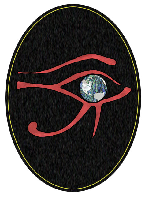 The red is a pearloid material that matches the red in the 12th fret inlay. For the globe, I tried several combinations, and found the paua shell sea and mop continents to give enough contrast to be useful. We could go all pearloid if you want to keep the blue/green style. Bob says I can't pull the tape off yet, but here's the mock up of the 12th fret inlay:  The actual inlay wound up having slightly less detail, after all, it is pretty small! Let me know what you think about the oval inlay and we'll get crackin' on it. | ||
| mica
Moderator Username: mica Post Number: 1327 Registered: 6-2000 |
Oh hey! I found this pic I emailed you before the board was all taped up: 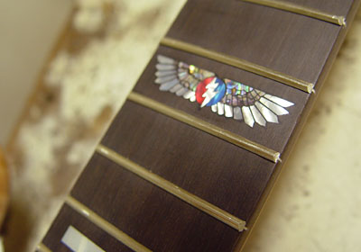 | ||
| palembic
Senior Member Username: palembic Post Number: 822 Registered: 9-2002 |
Nice ... it has an Indian/military feel over it. Must be the lightning/wings combination. I bet this guitar will lift up your playing!!! Paul the bad one |