| Author | Message | ||
| Mica Wickersham (mica)
Moderator Username: mica Post Number: 213 Registered: 6-2000 |
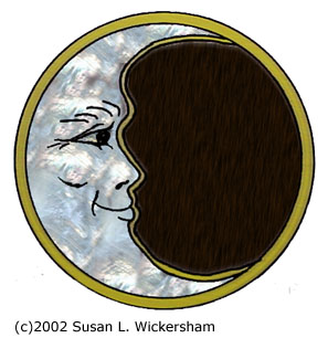
Here's the study for materials on your custom inlay for your Further guitar:  The ring and outline are to be in brass, the moon in figured mother of pearl, the sky in ebony. In the second study, I added a starfield. I picked Orion, but if you like the idea of the stars, we can use any constellation(s) you like. The stars would be small pieces of silver in three different diameters. | ||
| Mica Wickersham (mica)
Moderator Username: mica Post Number: 214 Registered: 6-2000 |
I should also mention the features on the moon are done with engraving. The original picture you sent has teeth showing, and in the muted carving, it looks good. When Susan designed this inlay, she thought the teeth didn't look good on the flat inlay. | ||
| Mica Wickersham (mica)
Moderator Username: mica Post Number: 352 Registered: 6-2000 |
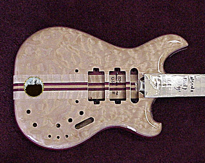
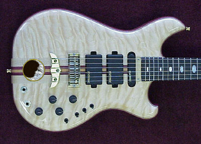
Your guitar is ready to receive the moon inlay. Here's a quick sketch of the "jollier" expression. Your actual inlay will have the Orion starfield like we discussed.  Any of the ones we tried with an open mouth look more scary and less jolly, so the wide smile seemed to work best. The engraving will be more precise than the quick sketching. and here is your actual guitar:  (I shrunk the inlay down and positioned it for fun). Jon is scheduled to start the inlay next week. Should be back in spray the 12th of November, and we hope to get the guitar to you before Thanksgiving. | ||
| Mica Wickersham (mica)
Moderator Username: mica Post Number: 406 Registered: 6-2000 |
Here's the orientation illistrated:   Let me know which you prefer, or if you have another idea. |