| Author | Message | ||
| mica
Moderator Username: mica Post Number: 3308 Registered: 6-2000 |
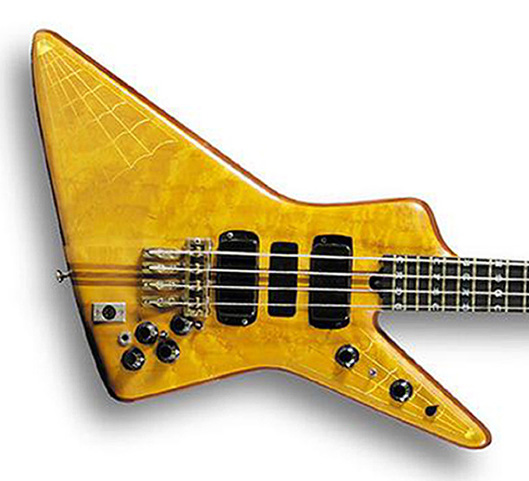
Here's something that concerns me about this replica. The original control layout is not good:  Notice how the neck pickup volume and Q switch are really crammed right up against the edge of the bridge. Now, that can't be fun to use. Also, the bridge Q switch is cramped to use. I regard the original layout as a mistake. There is actually room to scoot the controls away from the bridge and leave each with a little more breathing room. My question is do you want us to replicate the original layout of the cluster, or should we improve it while keeing the controls on the horn the same? | ||
| ajdover
Advanced Member Username: ajdover Post Number: 361 Registered: 11-2003 |
Mica, I'm all for improving it, as I think that's what John would have done. Besides, I'm playing this instrument, not him. Let's see where we can move them to. Having them up against the bridge would indeed be problematic for me, anyway. Lower horn looks fine. Thanks, Alan |