| Author | Message | ||
| mica
Moderator Username: mica Post Number: 3607 Registered: 6-2000 |
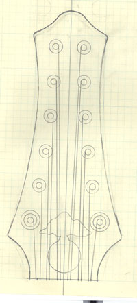
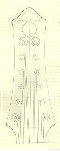
We're ready to cut the peghead out on your neck, but we need some more input from you. In order to get a straight string pull on 12-strings, the peghead would have to be an unmanageable 14 inches long. That doesn't sound like something you would want. Susan and Chip have come up with these designs, to keep it a manageable size. Hope you like one of them, the main difference is the logo position.   | ||
| byoung
Advanced Member Username: byoung Post Number: 379 Registered: 12-2004 |
I'd vote for #2, and bevel the edges. Or #1 with an omega and beveled edges. We get two votes, right? | ||
| george_wright
Intermediate Member Username: george_wright Post Number: 106 Registered: 3-2005 |
Have been off the grid since noon Thursday---went to the fortieth reunion of my college class. I hate the idea of obscuring the logo behind all the strings, but.... I'm imagining the shape of whole instrument. I think the one on the left would look better. The one on the right would, I think, look too big. Brad, as for the omega, well.... I know this will seem sacrilege to some, but points and omegas all seem like busy-work to me. They remind me of antique furniture. Mica, let's go with the one on the left, with the logo under the strings. | ||
| mtnst8
New Username: mtnst8 Post Number: 6 Registered: 8-2006 |
George, I agree on two counts. First, yes, it is sacrilege that points and omegas are too busy. But I also agree that the peghead on the right would be too big. See? We agree on everything!  That guitar is going to be something else. That guitar is going to be something else. Brad (Hmmm. We're becoming as ubiquitous as Olivers) | ||
| fc_spoiler
Advanced Member Username: fc_spoiler Post Number: 351 Registered: 5-2006 |
If you "hate the idea of obscuring the logo behind all the strings" Maybe the Logo inlayed in the body is an option? | ||
| tbrannon
Intermediate Member Username: tbrannon Post Number: 160 Registered: 11-2004 |
"Maybe the Logo inlayed in the body is an option?" I don't have any idea how Alembic feels about it, but I absolutely love Keavin's bass ( #12 )- he's got the logo below the bridge- it's killer. EDIT: The folks at Alembic must be OK w/ it- the Featured Custom for Feb 2000 has the logo inlayed there. (Message edited by tbrannon on September 24, 2006) | ||
| byoung
Advanced Member Username: byoung Post Number: 382 Registered: 12-2004 |
George, Not liking omegas isn't sacrilege! Way I figure it, you're paying for it, get what you want. I still think you should bevel the edges, though.  Bradley | ||
| mica
Moderator Username: mica Post Number: 3622 Registered: 6-2000 |
I got the word to Chip about your peghead preference, George. I'll post some more pictures when interesting things happen. | ||
| george_wright
Intermediate Member Username: george_wright Post Number: 107 Registered: 3-2005 |
Sounds good to me! |