| Author | Message | ||
| flaxattack
Senior Member Username: flaxattack Post Number: 1437 Registered: 4-2004 |
we'll go over the tracing before cutting yes? | ||
| mica
Moderator Username: mica Post Number: 4495 Registered: 6-2000 |
Here's a rough shape outline that catches what I think are the most interesting parts: 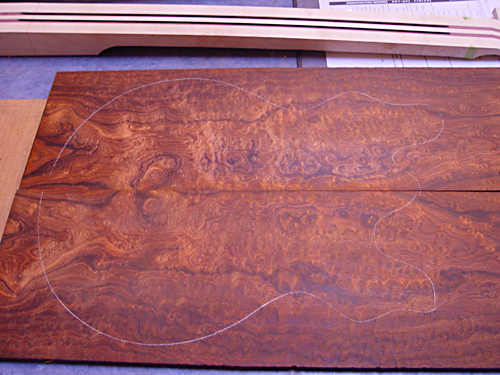 Let me know if you like it. | ||
| byoung
Senior Member Username: byoung Post Number: 614 Registered: 12-2004 |
Wow. If I might intrude-- I wonder what it would look like with the board flipped (i.e. straightish stuff towards the center)? Bradley | ||
| flaxattack
Senior Member Username: flaxattack Post Number: 1460 Registered: 4-2004 |
can i see the outline with the bout on the right side? maybe brad is on to something can we take a pic with his suggestion? | ||
| bassjigga
Intermediate Member Username: bassjigga Post Number: 188 Registered: 8-2005 |
I like it this way, but either way will be amazing. This board is ridiculous! | ||
| mica
Moderator Username: mica Post Number: 4514 Registered: 6-2000 |
Flipped: 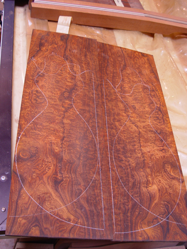 I really think all the cool stuff is over on the left side of post 4495. I'll draw another set of lines on here if you can't visualize the region, just let me know. Also, please note that this is an oversize rough-cut of the core for your bass used as the guide. The actual size will be a tad smaller. | ||
| flaxattack
Senior Member Username: flaxattack Post Number: 1461 Registered: 4-2004 |
this is not an easy board to imagine mica.... 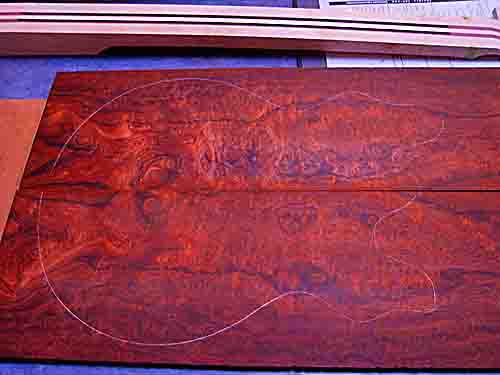 | ||
| flaxattack
Senior Member Username: flaxattack Post Number: 1462 Registered: 4-2004 |
i know i am a pain bit may i bother you for a bouts on the right layout | ||
| byoung
Senior Member Username: byoung Post Number: 623 Registered: 12-2004 |
Flax, I gotta say-- put the straight in the center. Bradley | ||
| the_8_string_king
Senior Member Username: the_8_string_king Post Number: 565 Registered: 9-2005 |
For what it's worth (maybe nothing) I think the way it's laid out in Mica's post 4514 above is much better looking than the way it's laid out in your post 1461 above. Mark | ||
| flaxattack
Senior Member Username: flaxattack Post Number: 1463 Registered: 4-2004 |
appreciate the feedback guys mica is going to lay out 1461 with the bouts on the right side and we will make a decision from there. problem is- they can see the boards better than we can. another set of very experienced eyes likes the first also | ||
| flaxattack
Senior Member Username: flaxattack Post Number: 1464 Registered: 4-2004 |
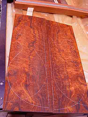 | ||
| flaxattack
Senior Member Username: flaxattack Post Number: 1465 Registered: 4-2004 |
i think all the really good stuff in this setting is at the edges. my hand will cover one side and the electronics would cover the otehr i sharpened the photo in adobe | ||
| lbpesq
Senior Member Username: lbpesq Post Number: 2342 Registered: 7-2004 |
Flax: It's all good - outstanding piece of wood! My favorite is directly above (1464). It almost looks like a natural sunburst and I like the wider dark part in the lower bout. Bill, tgo | ||
| byoung
Senior Member Username: byoung Post Number: 624 Registered: 12-2004 |
Flax, With all the stuff going on in that board, I'd try to get the high resolution versions of the pictures. I'm sure that if you ask nicely... Bradley | ||
| mica
Moderator Username: mica Post Number: 4523 Registered: 6-2000 |
Here's the photo you requested: 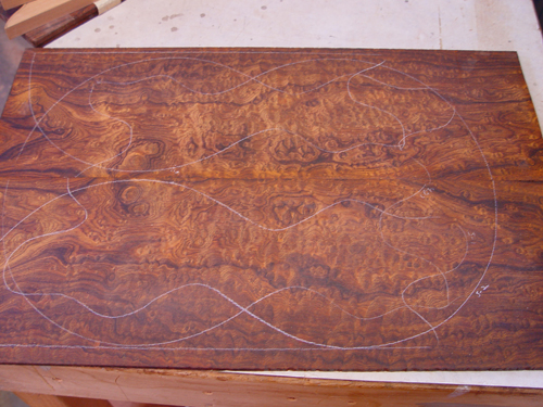 You'll have to dodge the previous lines, but I still need them for reference in case you select one of them, I'll have the same spots. Here's some levels adjustments and unsharp mask which looks like you were doing in Photoshop: 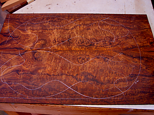 Even with a hires photo, these snapshots of a sanded surface aren't going to reveal all that's going on in the wood. You won't be able to see what the experienced eyes can see in person and predict about what it will look like when finished. I can email you a high res photo if you like, Jeff, just let me know (I don't send uninvited large attachments). | ||
| cozmik_cowboy
Intermediate Member Username: cozmik_cowboy Post Number: 137 Registered: 10-2006 |
Wow, there ain't a bad choice in the bunch! Must be terrible having to make such a tough decision, eh Flax? I think I'd probably go with the last one, though. Great googly moogly, what a board!!! Mica, do you think you could set some aside until I win the lottery? Peter (Message edited by Cozmik_Cowboy on May 02, 2007) | ||
| flaxattack
Senior Member Username: flaxattack Post Number: 1467 Registered: 4-2004 |
pete you have know idea for 250 bucks i should fly out to see it well we can eliminate post 1464- sorry brad- you'll just have to buy your own 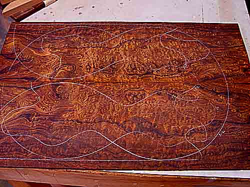 | ||
| flaxattack
Senior Member Username: flaxattack Post Number: 1468 Registered: 4-2004 |
mica you know i usually defer to the eyes on sight but you can send me a high res and give me some feedback | ||
| byoung
Senior Member Username: byoung Post Number: 625 Registered: 12-2004 |
Ha! I did buy my own. Just not quilted cocobolo. I feel like Dorothy in The Wizard of Oz- someday... Here's to hoping you get exactly what you want. Bradley | ||
| flaxattack
Senior Member Username: flaxattack Post Number: 1469 Registered: 4-2004 |
Thanks to all for your gracious input. but after seeing the hi res mica sent me, i have made my decision i am getting the first alembic rectangular shaped bass!. ok have chosen the last setup - bouts on the right. i gotta say it was really really hard. some spots i lost a little and others i gained.but ultimately i liked the way the v shape meets on this layout at the center edge more than the the other way there is no wrong position on the slab. and man it is frkn quilted up the gazoo also switched to qcb for the peghead front and back if there is enough left over anyone who wants to see the high res- shoot me an email now for the back woods thanks mica! | ||
| jacko
Senior Member Username: jacko Post Number: 1146 Registered: 10-2002 |
I like the grain in what's going to become the upper horn and also the very dark wavy line that follows the curve of the bout. You'r one very lucky guy Jeff. graeme |