| Author | Message | ||
| mica
Moderator Username: mica Post Number: 1558 Registered: 6-2000 |
Here's the Coco Bolo top with the Rogue body shape inked in: 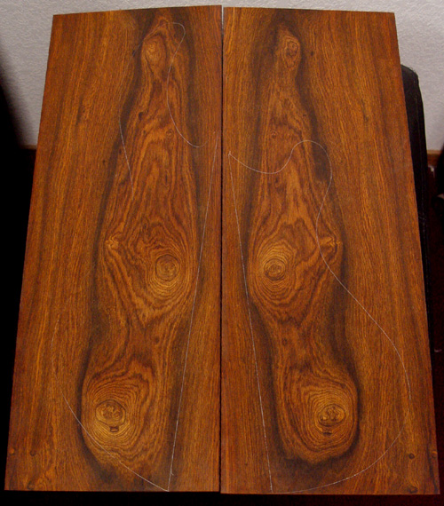 Love that little knot caught on the upper horn, most of it will show after the roundover. | ||
| bassman10096
Advanced Member Username: bassman10096 Post Number: 297 Registered: 7-2003 |
Grrrrreat looking piece of wood!! Can't wait to see this bass get built! Bill | ||
| mica
Moderator Username: mica Post Number: 1561 Registered: 6-2000 |
Susan's finished the mock up of the peghead inlays: 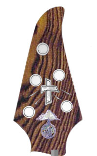 The materials are mother of pearl for the cross, and silver for the outline and rays. I just dropped a random piece of Coco Bolo in for the front veneer, yours will be different from the one in the mock up. | ||
| palembic
Senior Member Username: palembic Post Number: 1258 Registered: 9-2002 |
Although close to the "pointed" peghead this peghead design is IMHO the most "dynamic" + "classy" one of the Alembic range. For me It is -together with the "knobby one" THE ultimate peghead design for a Rogue. Again ....IMHO Paul the bad one | ||
| dnburgess
Advanced Member Username: dnburgess Post Number: 217 Registered: 1-2003 |
Sean, this looks kind of busy - and both logo and cross will be obscured by the strings. Either a cone or crown peghead would leave the cross unobscured and better achieve the effect you are looking for. Would it be possible to move the Alembic logo to the body - to leave the peghead uncluttered. I think I recall seeing examples of the logo on the body. | ||
| adriaan
Intermediate Member Username: adriaan Post Number: 177 Registered: 6-2002 |
About the peghead designs, the "Quietly Custom" FC (http://www.alembic.com/info/fc_kb.html) had a nice one too. A bit like a Hanewinckel peghead, to be honest. | ||
| palembic
Senior Member Username: palembic Post Number: 1259 Registered: 9-2002 |
Brother Adriaan, Yeah true! Hanewinckel?? Maybe but definitely aslo highly insipired (copy) of a Yamaha TRB type bass Paul TBO | ||
| dnburgess
Advanced Member Username: dnburgess Post Number: 218 Registered: 1-2003 |
Adriaan's "Quietly Custom" sugestion would complement the contemporary cross design. Hmm...I can feel a custom body shape coming on... BTW, the rays from the cross remind me of Arthur Crumb style sweat - kind of in keeping with the Passion. | ||
| adriaan
Intermediate Member Username: adriaan Post Number: 179 Registered: 6-2002 |
Arthur Crumb? So where would you draw the glasses? | ||
| dnburgess
Advanced Member Username: dnburgess Post Number: 219 Registered: 1-2003 |
Glasses would imply imperfection. | ||
| adriaan
Intermediate Member Username: adriaan Post Number: 181 Registered: 6-2002 |
Imperfection is my middle name, and it has hit me right on the nose in a big way. Yes, I'm proud to say I wear glasses. Some of them contain beer or wine, no doubt adding to the imperfections. But returning to topic ... What's with the round shape of the lower horn? Personally I would have liked to see more of the special cocobolo grain preserved, like with a wider body shape and/or a bookmatch-to-center. | ||
| susan
Moderator Username: susan Post Number: 37 Registered: 5-2002 |
Adriaan, The pen lines on the wood are tracings from the template and are not indicative of the final shape. This piece of wood was picked in particular for the lovely swirl patterns and the burls that were a particular request by the customer and to enhance the Rogue shape. BTW-we never go for the maximum yield on any particular board but rather how it will look in the final form with all the trimmings of pickups, hardware and knobs. So although it may appear to be "wasting" coco bolo, the left over pieces go for peghead fronts, some personal projects and we have the coolest handles on some of the hand tools. -Susan | ||
| mica
Moderator Username: mica Post Number: 1565 Registered: 6-2000 |
I'm working on the original Crown peghead mock up with some other ideas for the corss and logo placement. Those will be posted later. In the meantime, my mom finished the dove with the olive branch. Here's the mock up:  The main material is to be mother of pearl, with a silver beak, silver branch and abalone leaves. We thought a blue topaz would make a nice eye. Size is approximate. (Message edited by mica on April 08, 2004) | ||
| mica
Moderator Username: mica Post Number: 1566 Registered: 6-2000 |
Okay, how about some more food for thought. Originally, this bass was goign to have the Crown peghead shape, here's a mockup with that idea: 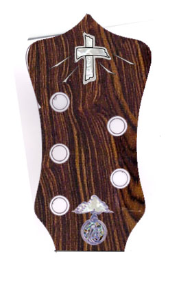 If you still didn't want the logo on the peghead, it will fit nicely between the pickups, something similar to this:  On the Rogue, there's no room below the tailpiece like on some others you may have seen. | ||
| dnburgess
Advanced Member Username: dnburgess Post Number: 220 Registered: 1-2003 |
IMHO the cone peghead might work better as it naturally leads the eye to the point. You could lose the Alembic logo completely (Shock, horror!). | ||
| waggaboy
Junior Username: waggaboy Post Number: 24 Registered: 2-2003 |
Excellent stuff!! The wood is better than I imagined -- how blessed am I to get 5 burls!! The cross shape is also fantastic - too good to put under the strings. Given it is Good Friday and I discovered this thread today gives me a warm fuzzy feeling :-) Can the top right burl on the wood be the peghead laminate and 6th burl? Would I be able to see a mock-up of the cross at the very top of the Orion 3+2 peghead without the Alembic logo... I can see on Ken's peghead that there would be enough real estate if we just took a small amount of the curve off the lower portion of the Orion - is this possible? I think the Crown looks a little unbalanced when compared to the upper Rogue body shape - that's why I abandon it earlier (with David's wise counsel!!!). The only way this would make a comeback is if we traded the upgraded logo $ for an Omega bodyshape -- but most of my Gigs are standing up and I haven't been able to beat the balance of the Rogue shape. Suggestions??? Staying with the Rogue shape, I think putting the Alembic logo on the body somewhere is the right thing to do... or as David dare suggest loosing it all together. Is it possible to fully inlay it into the wood (ie so it doesn't protrude at all)? I play in some dusty venues (sheds, fields, markets, etc) and that coupled with sweat would make cleaning it a pain if we put it near the pickups without countersinking it into the body. Also, for some reason the Dove image does not appear -- can you repost it so I can see. I am really keen :-) Thanks and Regards, Sean. (Message edited by waggaboy on April 08, 2004) | ||
| dnburgess
Advanced Member Username: dnburgess Post Number: 221 Registered: 1-2003 |
Sean, the logo specified in your design is inlaid and filled with clear acrylic, so it is totally flush with the surrounding wood and smooth to the touch. Regarding cone pegheads I just had a look at my 4,5 and 6 string models (I love this business) - and it looks like the 4 & 6 strings have room at the top for the cross, whereas the post for the A string goes where you'd want to put the cross on the 5 string. You could make a larger peghead - but I think it would be disproportionate. I haven't played a Rogue, yet, but it is universally praised for its balance. | ||
| dnburgess
Advanced Member Username: dnburgess Post Number: 222 Registered: 1-2003 |
Sean, I have emailed a picture of the dove inlay to your work email address. | ||
| valvil
Moderator Username: valvil Post Number: 406 Registered: 7-2002 |
I'm sure we'll find a satisfactory postion for the logo; however, losing it is not an option, all our instruments must leave the factory with a logo on. Valentino | ||
| mica
Moderator Username: mica Post Number: 1568 Registered: 6-2000 |
 Hope this works better this time. | ||
| dnburgess
Advanced Member Username: dnburgess Post Number: 223 Registered: 1-2003 |
Val, why the hard line on the logo? Anyone that couldn't recognise an Alembic without a logo probably doesn't know what an Alembic is anyway. Conversely, anyone that can recognise an Alembic doesn't need the logo to prove it. i.e. the logo doesn't maketh the instrument The build record would prove parentage if ever needed. If an artist (like Prince) is going to yank the logos off anyway, it seems more sensible (and would probably result in a nicer finish) to not put 'em on in the first place. As an alternative, how about just using the Alembic script. That might sit nicely (inlaid) above the nut and not detract from the cross. David B. | ||
| mica
Moderator Username: mica Post Number: 1569 Registered: 6-2000 |
I heard the betwixt the pickups picture didn't show up either: 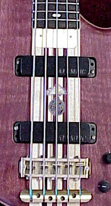 I should remember to change the format from Photoshop to jpg and not just the name, heh heh. This mock up is for an inlaid logo (completely under the finish). After it's inlaid, we cover it with an special optically clear epoxy, then more finish. It's completely smooth to the touch, feels just like the surface of the bass. It is my belief that an Alembic without a logo will be confusing in the future. All Alembics have logos and serial numbers. Sean, I'll do another mock up for you in the morning with cross on the Orion peghead. I think I'll need to slightly reduce the design, and we might have to modify the rays. | ||
| waggaboy
Junior Username: waggaboy Post Number: 25 Registered: 2-2003 |
Thanks All :-) My challenge on the logo is the overall size. Given the size of the cross and dove, we don't want the message overpowered by the logo... can I petition for a 1/2 scale version? Given the chosen AXY pickups, would there still be room for the logo between them (did I hear you say you are having a special on Series 1 electronics!!!!). If a 1/2 scale logo is possible maybe we can consider a change in the layout of the Signature dials/q-switches so the logo can go in the middle? If the logo is smaller this would look pretty cool, almost like the face of a clock. It is my job to keep time afterall!! Looking at my current Rogue it appears there would be enough real estate to support this approach? The dove shape is perfect - congrats to Susan! You have gone with a blue eye instead of a red one? What is the real eye colour of a dove anyway -- anyone!!!! The bass is meant to be "warm" (hence the gold hardware, choice of wood, etc)... and with all the fire analogies in the Bible around the holy spirit we may want to warm it up a little too :-0 Can we agree it would look best at fret 7? Will this change the scale of it? It could afford to be a little closer to the frets than indicated in Susan's picture. Just on shapes, it's important that the lower curve of the body and lower curve of the upper horn and the lower curve of the peg-head all have the same curve... I want to reinforce it with the peghead. If we need to change to body shape at all, that is my #1 criteria, that the curves all flow in the same arcs. I notice on my current Rogue that the tailpiece is very close to the end of the bass (much more so that my old Stanley). Will we need to extend the body's rear to fit the bird tailpiece? On the cross, I would prefer if the rays were a-symmetrical... so, don't feel restricted when you are trying to get it onto the Orion shape that the rays need to be the same on either side :-) Thanks!!! Sean. BTW, thanks for doing this in a thread. There are lot of musos at my Church -- and of course my wife -- who are now able to see the consideration and care that Alembic gives. (Message edited by waggaboy on April 08, 2004) | ||
| bob
Intermediate Member Username: bob Post Number: 186 Registered: 11-2002 |
Sean, Just my two cents, as a casual observer with no particular interest in the outcome. I don't mean this to sound personally critical in any way, just some thoughts and even a couple of ideas that might help. Personally, I think you're pushing your luck here. Alembic insists on relatively few things, like Alembic electronics, or not building you an instrument "they know" you won't be happy with, and to me it's perfectly reasonable they insist it go out with their logo. Most of this is, in fact, because they care about their customers, including those who may own these instruments in the future. If it's important enough to you to own an Alembic, then I should think you would be willing to respect that. I also think that in this case, size does matter. It's part of what makes it official, and there was some concern expressed about this in a discussion about Alembic jewelry (archived in Miscellaneous). Now, I suppose if you're getting one inlaid - and one assumes it will therefore be there forever - maybe a different size would be barely acceptable, and maybe they already are smaller than the cast ones, I'm not positive. But hey, it's not like you just hit the zoom button and crank one out at another size - these are fairly intricate things, and a custom size is going to be a pain (and probably expensive). So here are a few different approaches that come to mind. First, you could just get the cast logo on the peghead and then remove it yourself. I don't know how they're attached (perhaps someone else will comment), but my guess is that at worst you might need to refinish the front of the peghead, and might get away with a small touch up or even ignoring it (the cast ones are clearly put on after finishing). I certainly don't advocate this, but it is your bass at that point. Or, maybe Alembic would be willing to put it on the back of the peghead. Again, I'm just thinking out loud here - there are certainly some limits (e.g. let's not try for inside a coverplate), but it might be a simpler solution all around, including placing the logo in a sufficiently subservient posture. I think maybe you're worrying too much about dust and dirt collection. If it's as bad as you make it sound, by the time you get the bridge cleaned, dusting off the logo won't seem like a big deal :-) In fact, if you just keep a small brush in your case, you could probably keep up with it pretty easily. Also, I find that with a silver logo positioned underneath silverish strings, it kind of blends in. Though it may be larger, it doesn't draw attention as much as an inlay. It's surprisingly subtle, and looks more like pewter than silver. If you do go with an inlay, maybe you could tone it down a little without shrinking, by using a simple backing like ebony rather than the bright and colorful mother of pearl. I don't really know if that's feasible, but from here it seems like it might be simpler than some of the other ideas. Just some thoughts to kick around, hoping you can get this worked out without much more difficulty. Good luck. -Bob Oh, by the way - the dove is generally quite nice, but my first thought on seeing it was that the poor thing had this branch going down its throat. Sorry, maybe I shouldn't have said that, but I think I'd prefer to see the branch going through the beak at an angle, coming out the other side, or something like that. | ||
| malthumb
Advanced Member Username: malthumb Post Number: 203 Registered: 5-2002 |
Bob, Looks to me like the branch does go through the beak, just under the eye. It's hard to see because there's not a lot of contrast, but it is there. Peace, James | ||
| waggaboy
Junior Username: waggaboy Post Number: 26 Registered: 2-2003 |
Just wondering... would the Coco boards be large enough for this body shape -- it is a gorgeous meld of Rogue and Omega :-) http://alembic.com/club/messages/631/7485.html Thanks, Sean. | ||
| adriaan
Intermediate Member Username: adriaan Post Number: 190 Registered: 6-2002 |
I think the idea is that the dove's head is turned away, looking upwards, so the twig is actually pending from the side of the beak. Perhaps if the eye was set a little lower? I must agree with Bob that it looks just a bit odd. Will the twig inlay be in the correct wood species? And would we be talking palm twig for Easter (it happens to be Good Friday today) or laurel twig for Noah? Sorry if my biblical trivia aren't up to scratch. I can certainly appreciate the dove motif, but I don't think you should have AND the dove AND the cross AND the Alembic logo. The cross is the ultimate mark of sanctification, and I think a musical instrument should remain in a purely spiritual vein, hence my preference for the dove. | ||
| bob
Intermediate Member Username: bob Post Number: 187 Registered: 11-2002 |
You're right, James, I can see it now that you've pointed it out. Thanks, my throat feels better now. | ||
| smokin_dave
Member Username: smokin_dave Post Number: 97 Registered: 10-2002 |
HAHA,I recognize that purpleheart Rogue 5.I like the placement of the logo or placing it horizontal to the neck between the pickups perhaps? | ||
| susan
Moderator Username: susan Post Number: 39 Registered: 5-2002 |
Sean, I appreciate your sentiments regarding your symbolism and since the logo cannot be made in a half size, I suggest that we inlay the logo in back of the peghead. I think that pretty much solves the dilema. Your message will be clear. A dove's eye is a pinkish red and we plan on using a small pink sapphire or rhodolite garnet for that purpose depending on the size and color that is appropriate for the effect. We put the dove at the 12 th fret since that is how it was what originally requested on your order. I am willing to move it to the 7th fret position. It will be larger in that space. Your order was for a Rogue body shape and the curves of the Rogue do co-ordinate nicely with each other. Since you approved of the wood choice and placement, it was cut yesterday to shape. The head stock is done and has a burl on it from the same board. Regarding the placement of the bird tailpiece, we don't change the body shape we set the body slightly lower on the neck to allow for the bird tailpiece. No problem with the placing of the rays in an asymmetrical fashion. -Susan |